
V-Pulse Dataviz
"V-Pulse Dataviz" is an interactive data visualization art installation created for Toyota's Digital Innovation Garage (DIG). Displayed on a large touch screen in DIG's co-working space, it aims to impress visitors, enhance the innovative atmosphere, and provide insights into the activities of various DIG teams. The visualization depicts the number of feature stories each team has delivered over the past three weeks.
Project Overview

V-Pulse dashboard app showing trend of weekly velocity and volatility of DIG teams
the original V-pulse dashboard
DIG comprises numerous product teams, making it challenging for leadership to monitor all activities. To address this, Tanzu Labs developed the V-Pulse dashboard, which utilizes API data from project management tools to display trends and insights regarding team development velocity and story counts.
V-pulse dataviz project: data visualization as an art piece in the office space
The V-Pulse Dataviz project serves a different purpose: as a data visualization art installation within the DIG co-working space, it is designed to be observed by members and visitors. The brief for this project was to create an engaging visualization using live data from V-Pulse to display on the office wall, with an organic aesthetic reminiscent of swimming fish or blooming flowers.
Team & responsibilities
Given the project's short timeline of about a month, close collaboration was essential. The team consisted of a product manager, a developer, and myself as the designer. Together, we determined which data points to display and how to visualize them effectively. I was responsible for:
Selecting relevant data and determining visualization methods, including logic and style.
Designing the UX/UI of the data visualization page, which included redesigning the existing V-Pulse logo.
process
Defining purpose of the screen
We established that the screen should:
Foster creativity and inspiration by presenting beautiful and engaging visualizations.
Provide insights into recent activities of the DIG organization and individual teams.
Motivate DIG members by highlighting achievements, such as feature deliveries and new releases.
To avoid demoralizing members, we ensured that comparisons between teams were indirect and presented playfully.
Choosing the right graph type
We sought an organic and dynamic graph capable of conveying sufficient information. A force-directed graph from the D3.js library was selected as the foundation for our visualization. This graph features nodes that repel each other within a boundary, connected by elastic links, and allows user interaction through node dragging, creating dynamic movements.
<< you can try dragging nodes on the graph on the left side, to see how it BEHAVES


Mapping data to graph
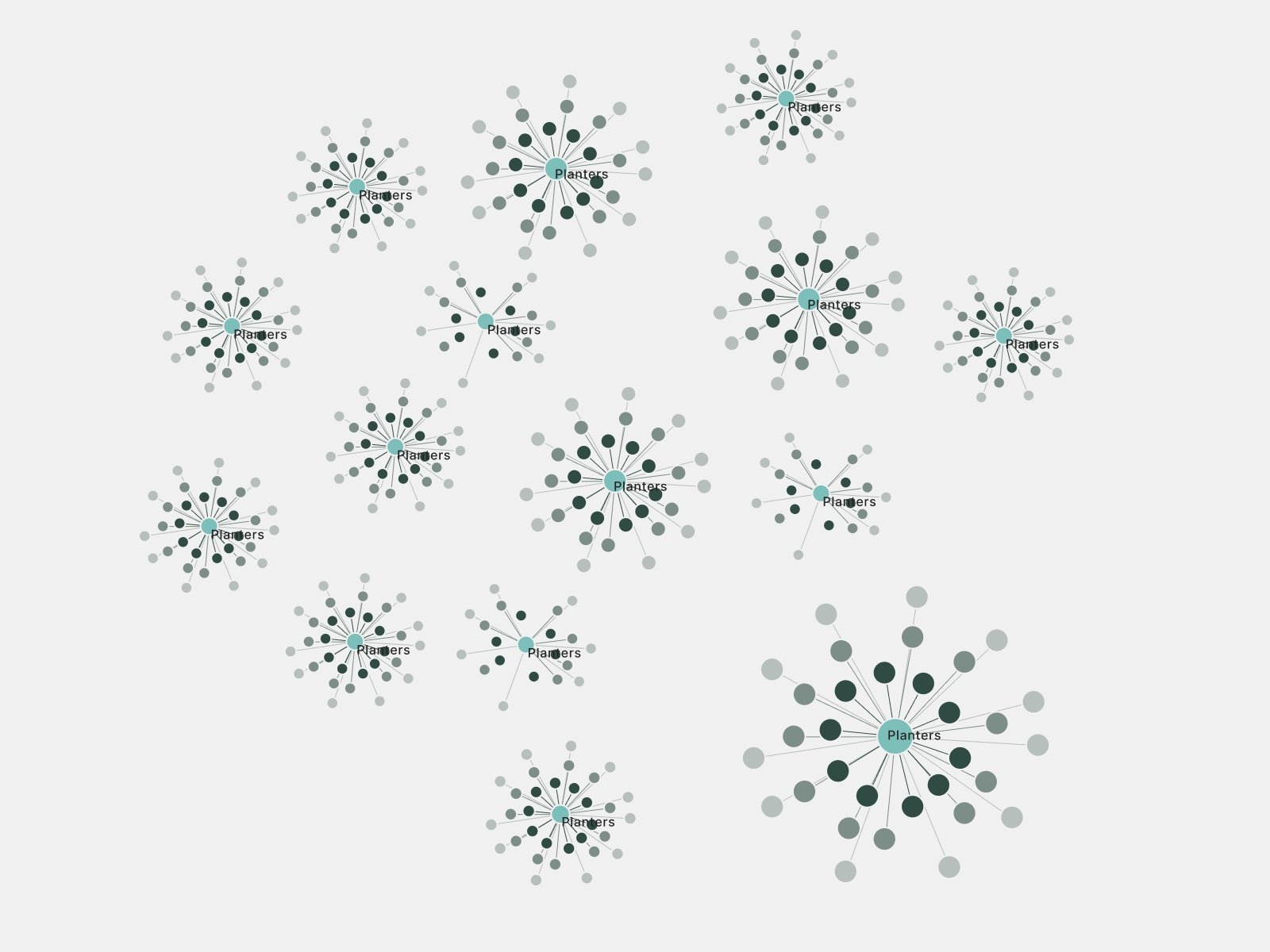
There are mainly 3 components in this visualization
Team nodes
Biggest nodes in the center of each group represent each team, and display their name.Feature story nodes
Smaller nodes connected to the team nodes represents feature stories recently delivered by the team.Links connecting team and feature nodes
From the second iteration, we applied 3 different length to links. The inner rim(shortest links) shows features stories delivered this week, mid rim represent last week, and outer rim shows 2weeks ago. This way, observers can see recent trends of teams’ activities.
guaranteeing the visual balance of graph based on live-data

This is the graph with fixed link length, before applying my formulae. This might look ok as is, but it might lose visual balance if number of nodes changes a lot.
As described in the previous section, we applied 3 different length to links based on how recent they are. At the beginning, we assigned fixed values to links as shown on the image on the left.
However, I found few problems with fixed value approach.
The graph is using live(and growing) data. Number of nodes(both team and stories) would increase or decrease unexpectedly- which could lead to too dense or sparse graph.
Each team has different number of nodes. with fixed size, all team graph size are same and some will look too dense or empty, based on number of nodes they have
So I came up with some formulae to make the length of links dynamic, so that lengths can adjust based on how many nodes are on entire graph, and within each team.

Making length of links adjust themselves to the node density of the graph
I wanted to make links longer when there are less nodes, and shorter when there are more nodes and graph becomes dense.
to define relation between number of nodes and length of links,
I imagined square area divided into different number of grid,
with nodes in the center of each cells.
with simple math, I realized distance between nodes when evenly distributed can be roughly calculated as “side length of graph” divided by “square root of total number of nodes”(the area of graph is always square)
Using this “standard link distance” as a variable for link lengths, I made sure the whole graph look balanced regardless of number of nodes changes.

making the size of each team’s node group proportional to the number of nodes the group has
Next step was making sure size of each team’s graph becomes larger and smaller based on the number of node it has.
I created a formula that defines relation between “standard link distance” and “radius of team X’s graph” based on the number of nodes in the team.
After applying this formula, each team’s graph size proportionally represented how many feature story nodes they had. And contrast in size between groups made the visualization more interesting.
Adding Release information

On the right side of the graph, we decided to put recent and upcoming release information from all teams.
We expect it to create moments of celebration and promote feeling of progress.
Adding team details view

Early figma sketch of team detail view
For simplicity of the graph, we only display number of feature stories, not by points. So it doesn’t necessarily represent team’s velocity(points /week) precisely.
We added team details view for the graph, so that people can see more detailed stories and release information of selected team.
It also shows total and monthly active users of their products, as well as Net Promoter Score if available.

Testing transition between overview and details view
We ideated and tested multiple ways to transition between overview and details views. As a result, we chose to increase team’s graph’s scale by 50% when they are selected.
Changing the size of selected team’s graph not only make the selected graph easier to spot, but also creates interesting movement on the entire graph because enlarged team pushes other graphs away from it.
In addition, I added a new out-focused state to team’s that are not selected in details view, so that their color can be muted and make the selected team stand out even more.
style & color mode


As the original V-pulse dashboard has light and dark mode, I also prepared both color mode for the graph. However, since it is not very crucial feature, I put it as a hidden playful feature where user can click the product logo on the top corner to switch between the color modes.
Result
This data visualization is currently installed in Toyota’s DIG co-working space, and members can see new nodes popping up and making their team’s presence larger(and pushing other teams around!) as soon as they deliver and accept stories on their project management tool.
Users are saying getting immediate visual feedback of their recent achievements is rewarding, and also it creates healthy amount of competitive mood among teams in a playful way.